3.1
The Gerstner grid
The appearance of a website, its layout and the guidelines for creating it are many and varied. There is no end to the theories and opinions: golden ratio, Fibonacci series, his spiral, two columns, three columns, flat design, parallax, material design, single page scrolling — all sorts of things.
This is the field of graphic design and it’s a bit complicated (apparently some people even make a living out of it). I looked at many different styles and did some research — I started with the Gutenberg Bible (1455) and learnt all about the Van De Graaf canon†1 (no relation to the Van De Graaff of generator fame); and this was good, but only really for printed documents. I wanted something that works on the web.
I finally settled on the Gerstner grid. This was developed by Karl Gerstner†2 in the 1960s for laying out magazines. And it’s clever, really clever — those of you (and me) of a certain inclination are going to love this — let’s call ourselves pedants (or engineers).
The Gerstner grid arrangement was developed for the publication of a business and economics magazine (Capital) in 1962 (Figure 3.1):
| †1 | For those of you that still have a will to live, the pdf version of this document is constructed using the Van De Graff cannon — I explain it in Appendix xxx. | ||
| †2 | Karl Gerstner (b.1930) is a Swiss graphic designer that worked in advertising from the 1950s onwards. In 1962 he worked on the design of a business magazine called Capital. It was while working on Capital that he developed the grid arrangement that determined the layout and appearance of the magazine. The same grid I’m using here. | ||
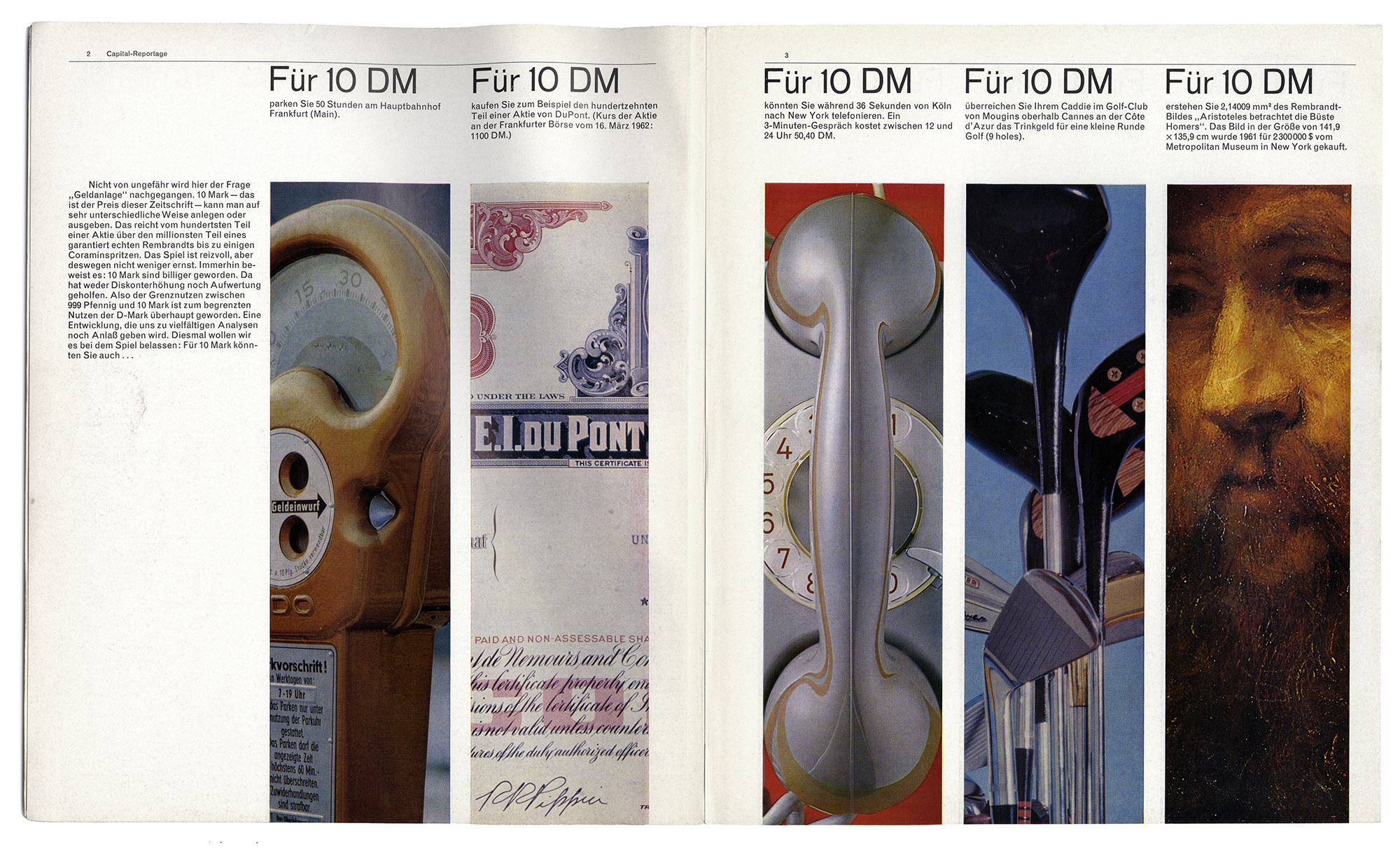
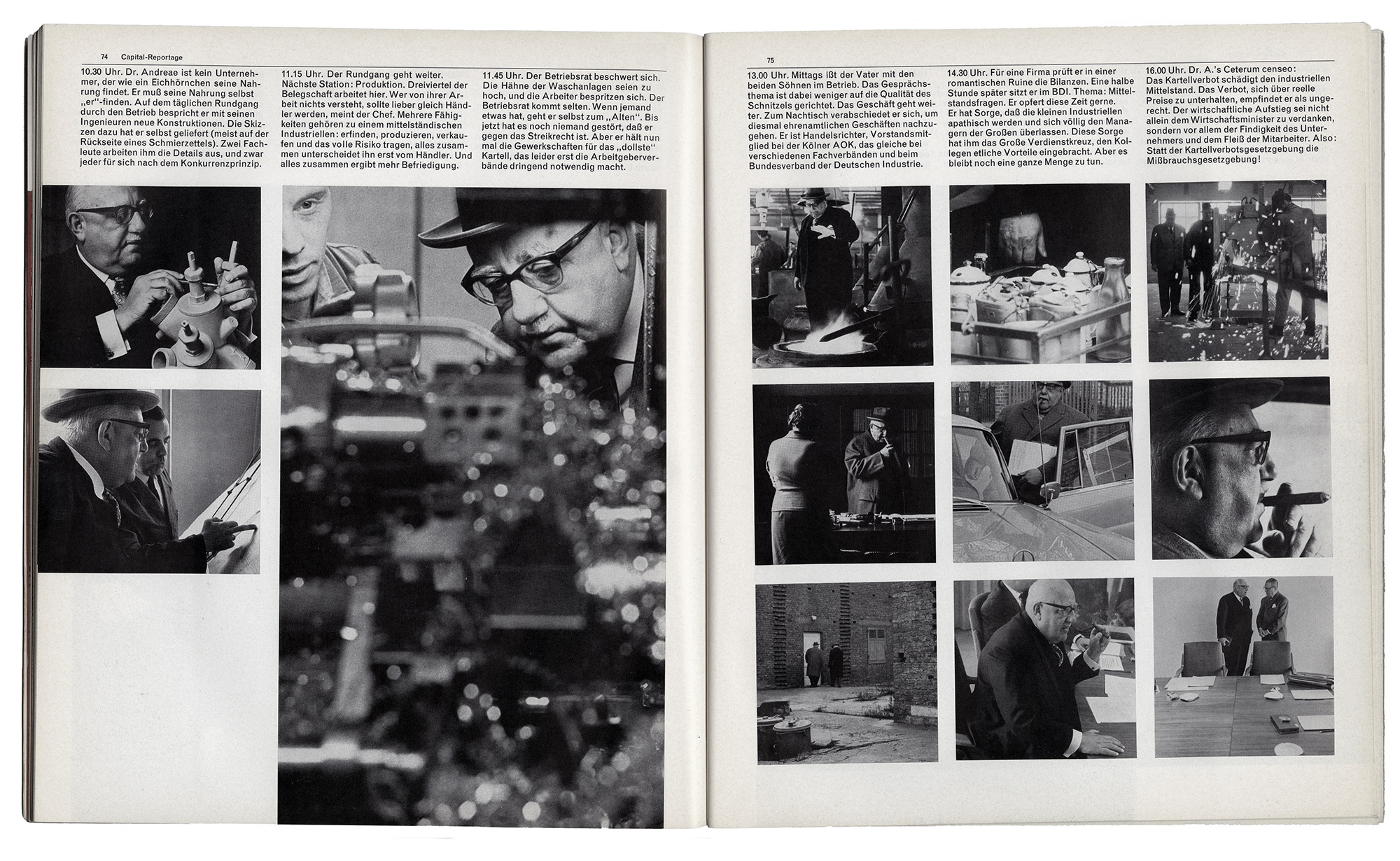
Figure 3.1 Capital magazine
These images are reproduced courtesy of the Herb Lubalin Study Center at The Cooper Union, New York.
Their website is: lubalincenter.cooper.edu
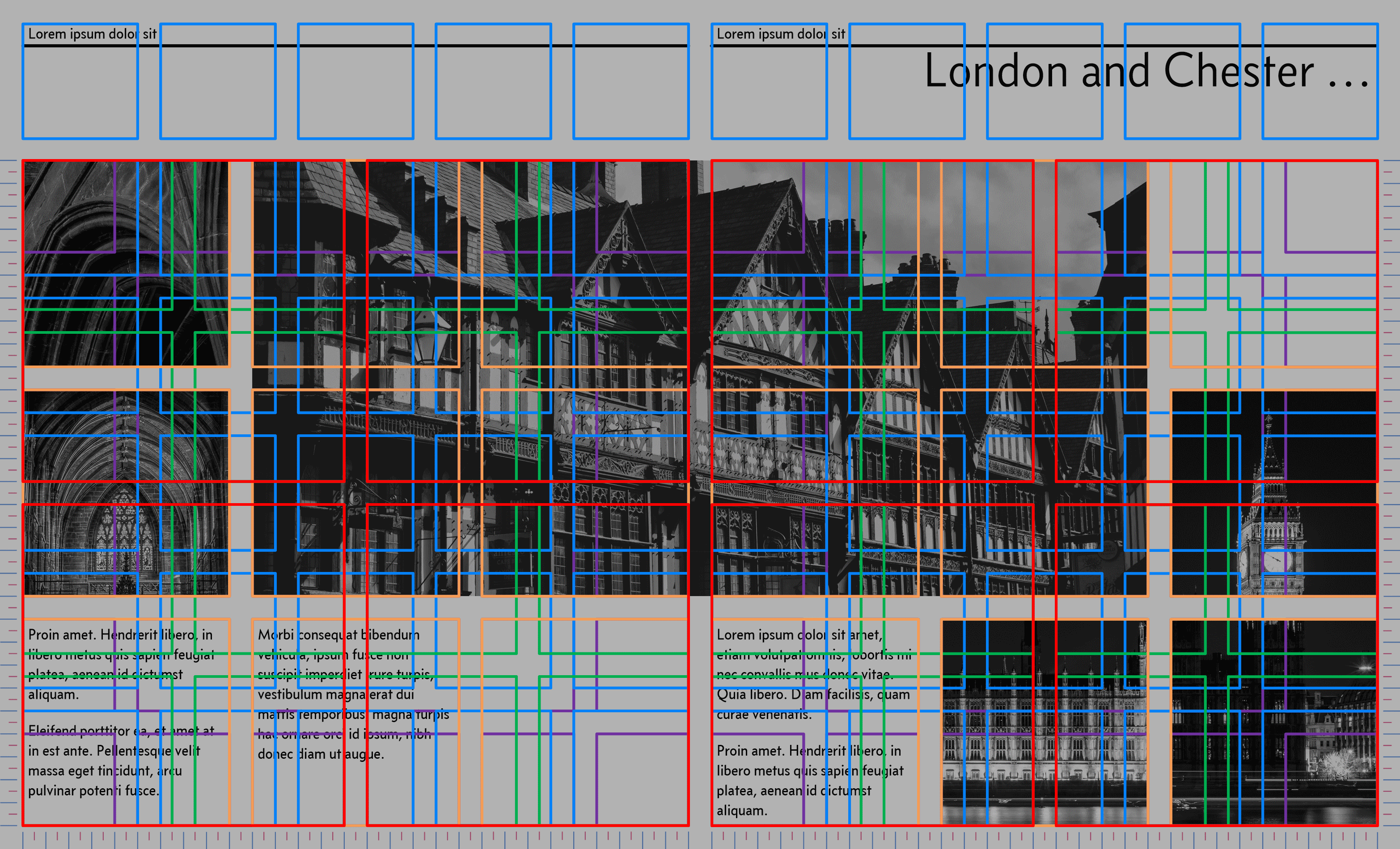
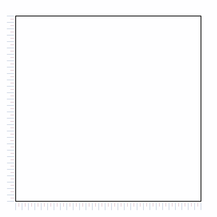
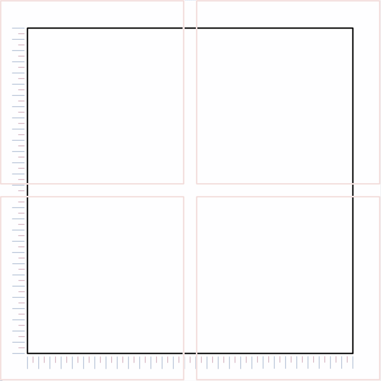
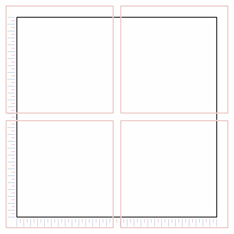
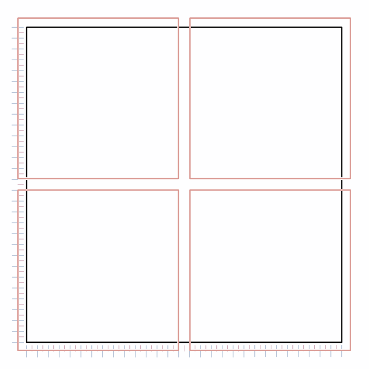
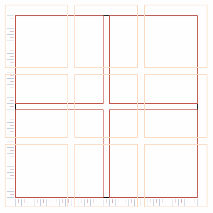
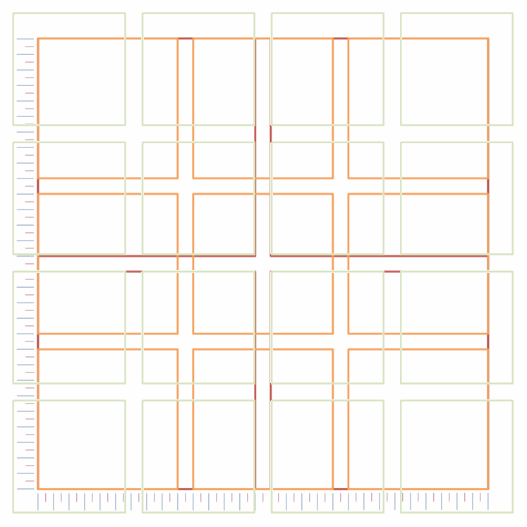
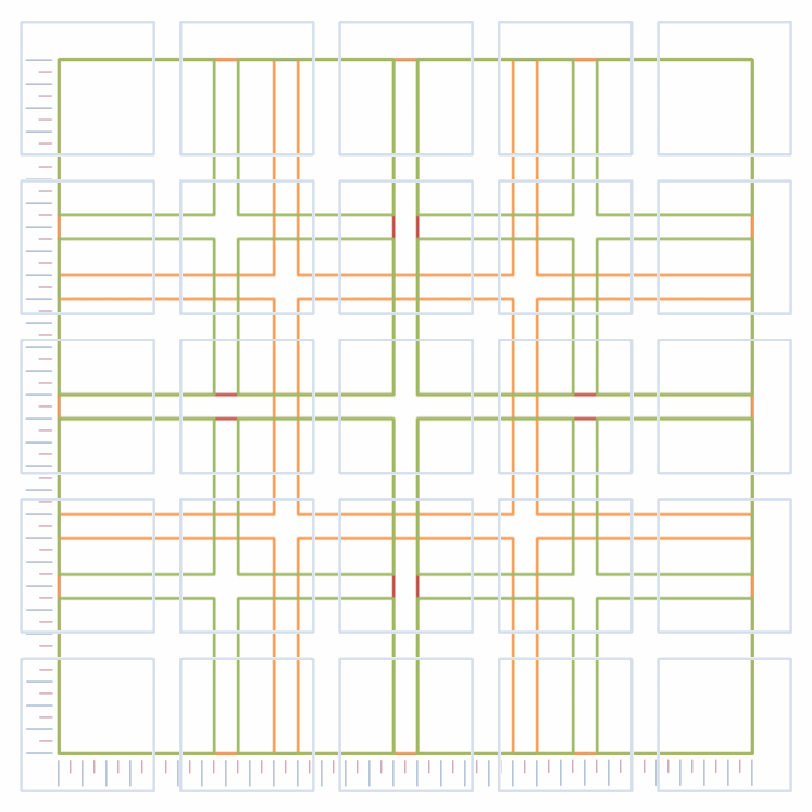
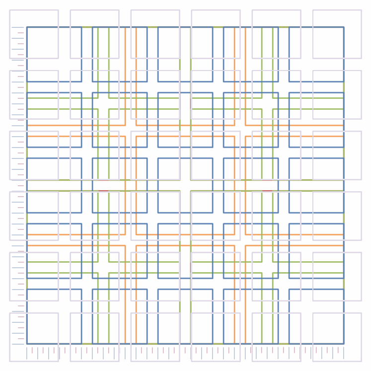
The Gerstner grid is a modular grid arrangement in a square of 58 units by 58 units. It looks like this:

Figure 3.2 The Gerstner grid
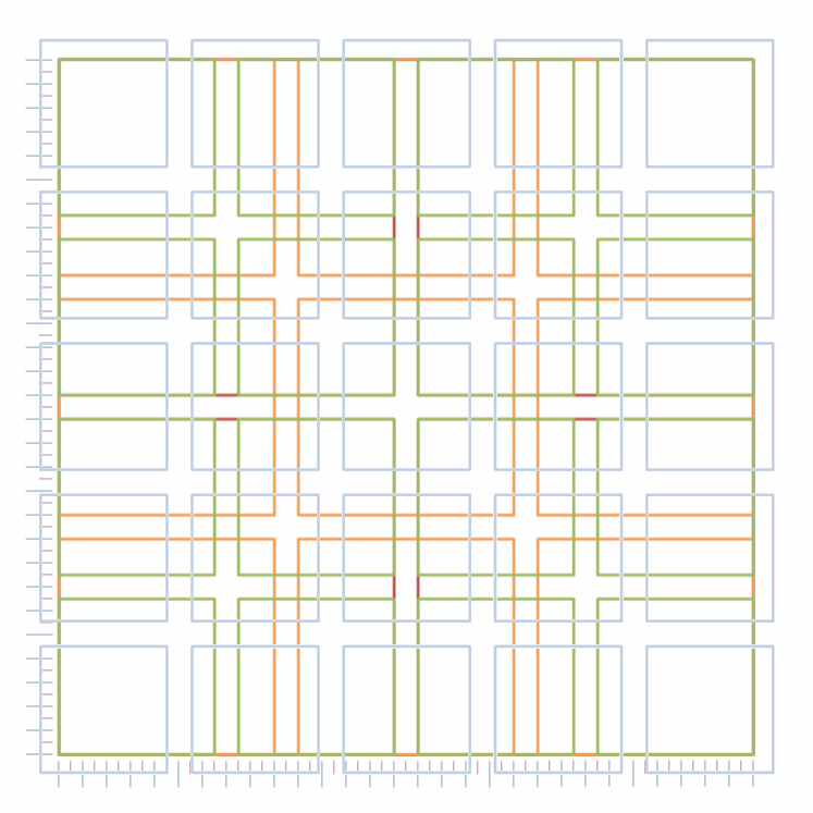
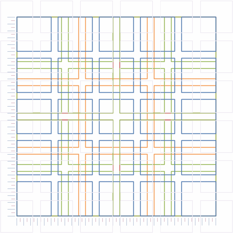
This I agree is a bit confusing; but really it’s just squares laid on top of each other — you can see an animated version of this below; just scroll down, you’ll get the idea of how it works:
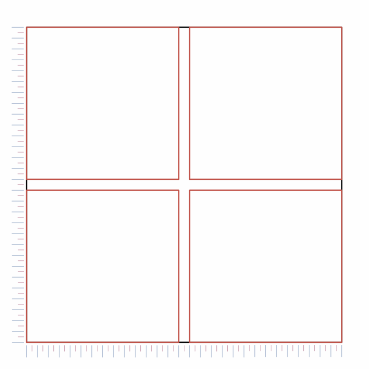
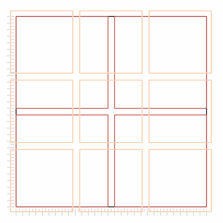
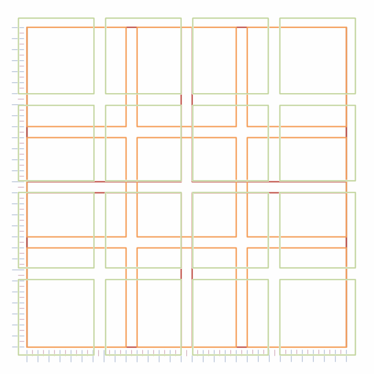
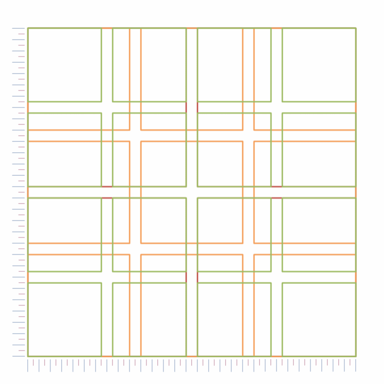
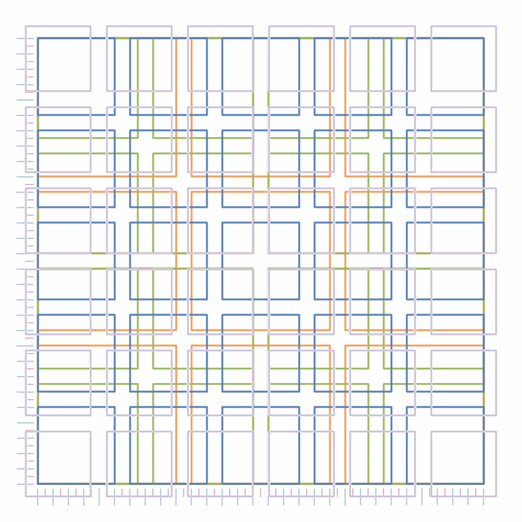
- I give an explanation of how I animated this square in appendix xxx. There is a much better version of this animation in the Herb Lubalin flatfile magazine. I havn’t figured out how they did it yet, but when I do I’ll update the site with instructions.
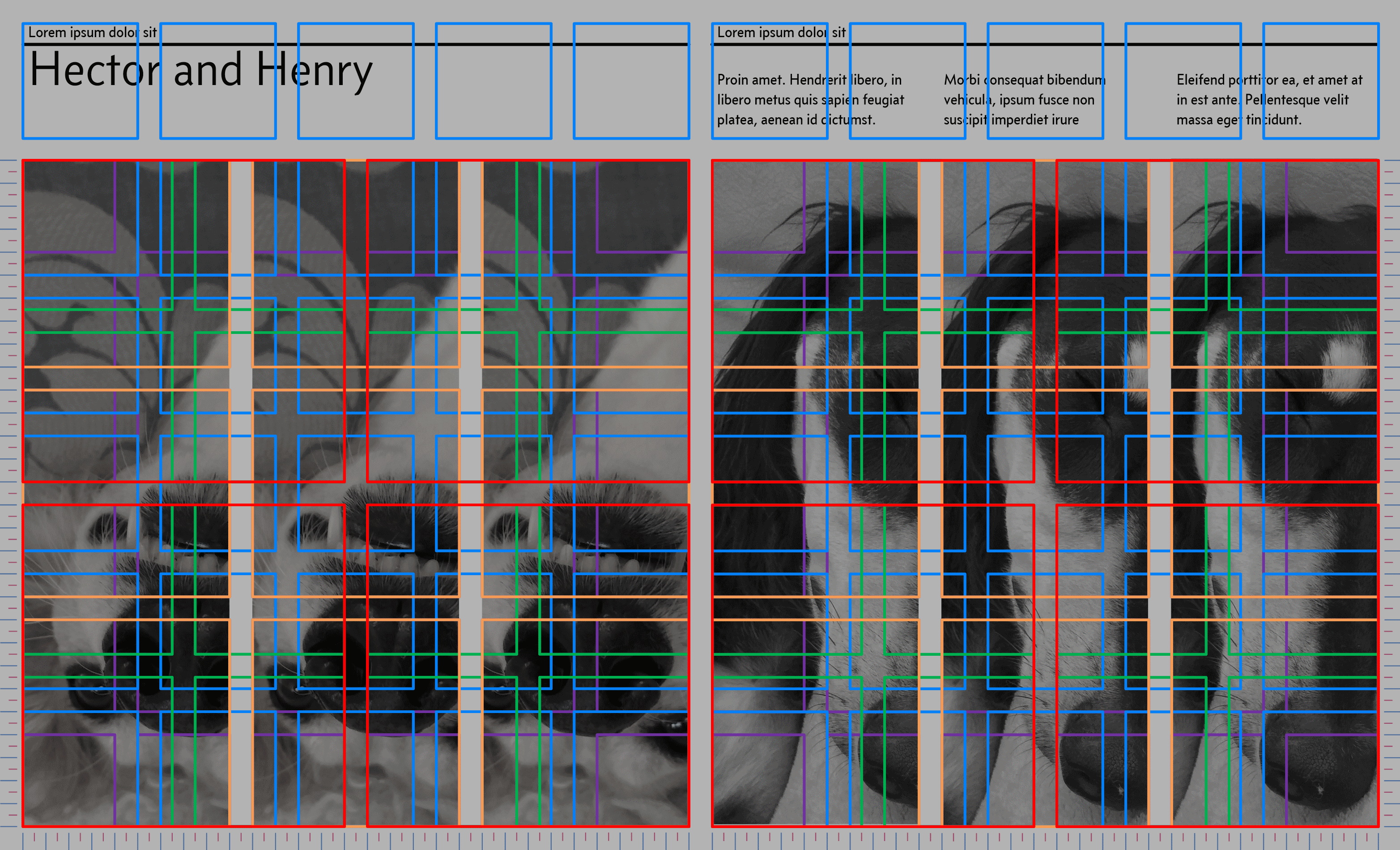
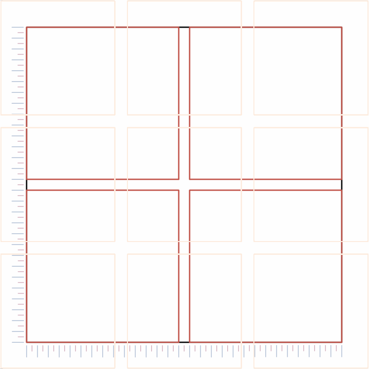
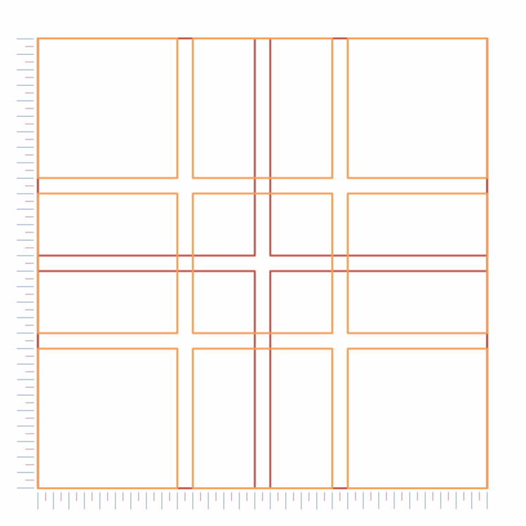
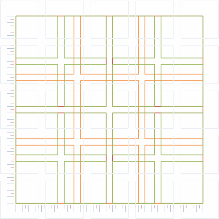
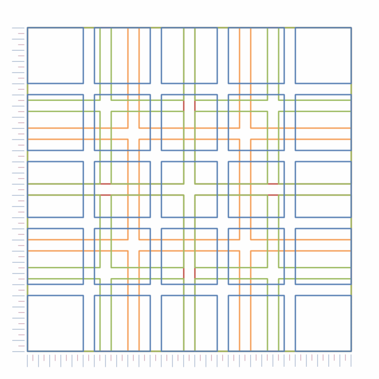
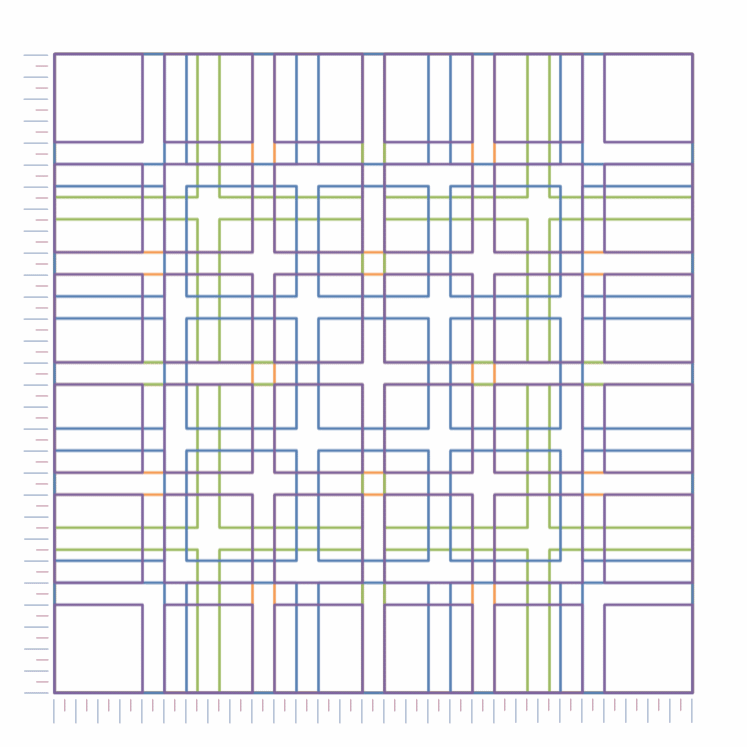
Things become clearer if I show this as a series of columns, and after all, the website is based upon columns (Figure 3.3).

Figure 3.3 Gerstner grid as columns