3
After all that, I’ve come to the following conclusions about the website:
It will use the Gerstner grid
It will use the Equity font set
It will have a line spacing of 135%
Really? — Just three conclusions after all that?
Well yes, sorry.
There are several points to address to complete the basic layout
How wide should the website page be?
How many columns should it be split into?
What font size should be used for body text?
Taking these in order:
The Gerstner grid is 58 units wide with a unit being based on the point size of the body text; so whatever page width is chosen, it must be wholly divisible by 58.
The next question is what maximum width is acceptable and this is a question of typical browser window size and to some extent monitor resolutions.
The following chart shows the worldwide statistics for screen resolutions:
Roughly 65% of monitors have a width of 1280 pixels or greater (if the ‘other’ category is ignored, this increases to 82%).
Since the website will be responsive, it will adapt to smaller resolutions, but an upper limit (a maximum width) must be defined; and so I’ve decided that the maximum width of the website page content will be no greater than 1280 pixels.
Remember that the maximum width must also be a multiple of 58 (for the Gerstner grid) and the nearest multiple of 58 to 1280 is 1276 (22 × 58 = 1276).
So that’s it — the website will have a maximum width of 1276 pixels |
|
I recently updated the above diagram and things haven’t changed that much. This is what it looks like now (June 2018):
The number of monitors with a width of 1280 px or more has increased from 65% to 70% in the last 18 months.
This is a personal choice, I want three columns, I want a large column in the middle and a smaller column to either side. Like this:
The best option for doing this with the Gerstner grid was to use a five column arrangement; there would be a single width column on each side and a central column that would span the three remaining columns in the middle.
This was my sketch for how I wanted it to look:
The sidebars are for notes, the blue area holds the navigation links to all the sections, there is a general navigation bar at the top for moving around the website and a footer navigation at the bottom for contact information &c.
Using a page width of 1276 pixels, a unit is 1276 ÷ 58 pixels, or exactly 22 pixels. This gives the following:
Column | No. of columns in Gerstner grid |
Width in units |
Width in pixels |
|
---|---|---|---|---|
Left sidebar | 1 | 10 | 220 | |
Column separator | N/A | 2 | 44 | |
Central column | 3 | 34 | 748 | |
Column separator | N/A | 2 | 44 | |
right sidebar | 1 | 10 | 220 | |
Totals | 5 columns | 58 units | 1276 pixels | |
Table 3.8 Website layout dimensions |
So the general layout is:
Three column website, two thin sidebars and wide centre for content |
|
The Gerstner grid dictates the font size; the font size of the smallest body text should be the same as the unit size.
In this case the unit size is 22 pixels (1276 pixels ÷ 58 units) and therefore the font size for the body text of the website should be 22 pixels.
The problem with this is that when I tried it, 22 pixels it was a bit small — the reason for this is that the Gerstner grid is designed for printed material and we’re building a website — “what’s the difference?” your ask.
Well the main difference is that a website is viewed on a computer screen and these tend to be further from the eye than say, a book or newspaper would be if you were reading it.
Consequently, it is usually necessary to use a larger font on a website than with printed material — simply for the reason that it’s further away and looks smaller.
There is another way to look at the point size; it’s widely accepted typographical practice that the number of characters on a line (including spaces) should be between 45 and 90. Lines longer than this are harder to read, the eye has to travel further at the end of each line.
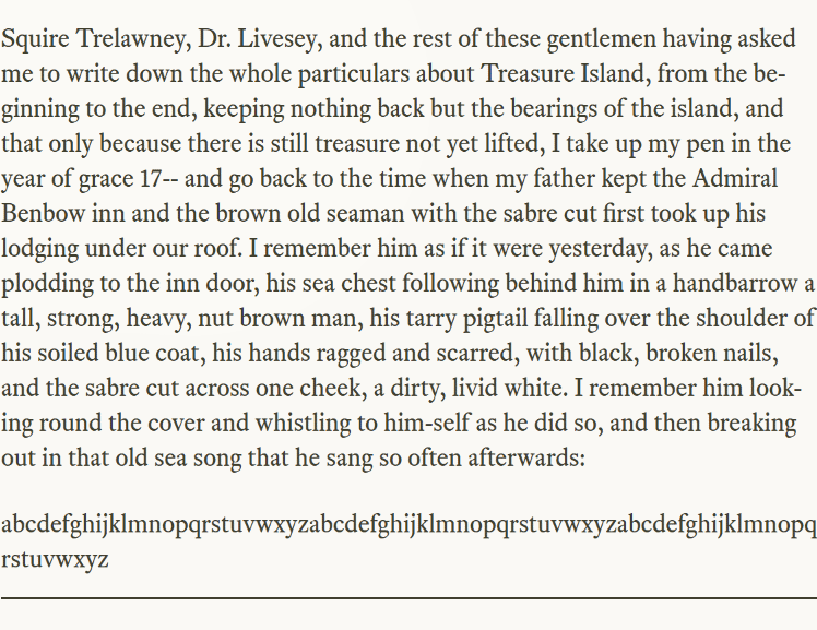
This (Figure 3.22) is a screen shot of a long paragraph inserted into the website; the paragraph is again taken from Treasure Island†1.
The first 12 lines (everything except the last partial line) have 960 characters including spaces. This gives an average of 80 characters per line — well within the 45-90 character limit — perfectly acceptable.
Another rough rule of thumb is that 45-90 characters with spaces works out at between two and three lowercase alphabets without spaces (the second paragraph in Figure 3.22).
In this case, ending at the q in the third alphabet, there are 2.65 lowercase alphabets.
The text in Figure 3.22 is all at 24 pixels.
So 24 pixels works from a line length point of view and it’s not much different from that calculated by the Gerstner grid unit size. So that’s it:
The body text font size for the website is to be 24 pixels |
|
†1 | Robert Louis Stevenson (1883, Cassell & Company) |