9
Finally, the PS fonts (Practical Series fonts). Now unfortunately, these are fonts that I made myself—and I’m sorry, they’re not very good—please feel free to use something else. For what they’re worth, you are welcome to use them however you want.
What I can tell you is that making a font is quite difficult—especially when you’re starting from scratch and know cock-all about it. It’s difficult partly because it’s a complicated process and you need to know a lot about it; and also because the font making programmes are neither intuitive nor easy to use (they could have been made by the people responsible for PhotoShop)—it took me a long time to figure out how to do it.
Making a simple font is a bit of an aside and not really to do with the website—for those of you who are interested in such things, I take you through how I did it in appendix xxx (it’s not something you need to know).
I made two fonts for the website, the first is a series of icons; the second is a numerical index font (numbers within circles). Looking at these in turn:
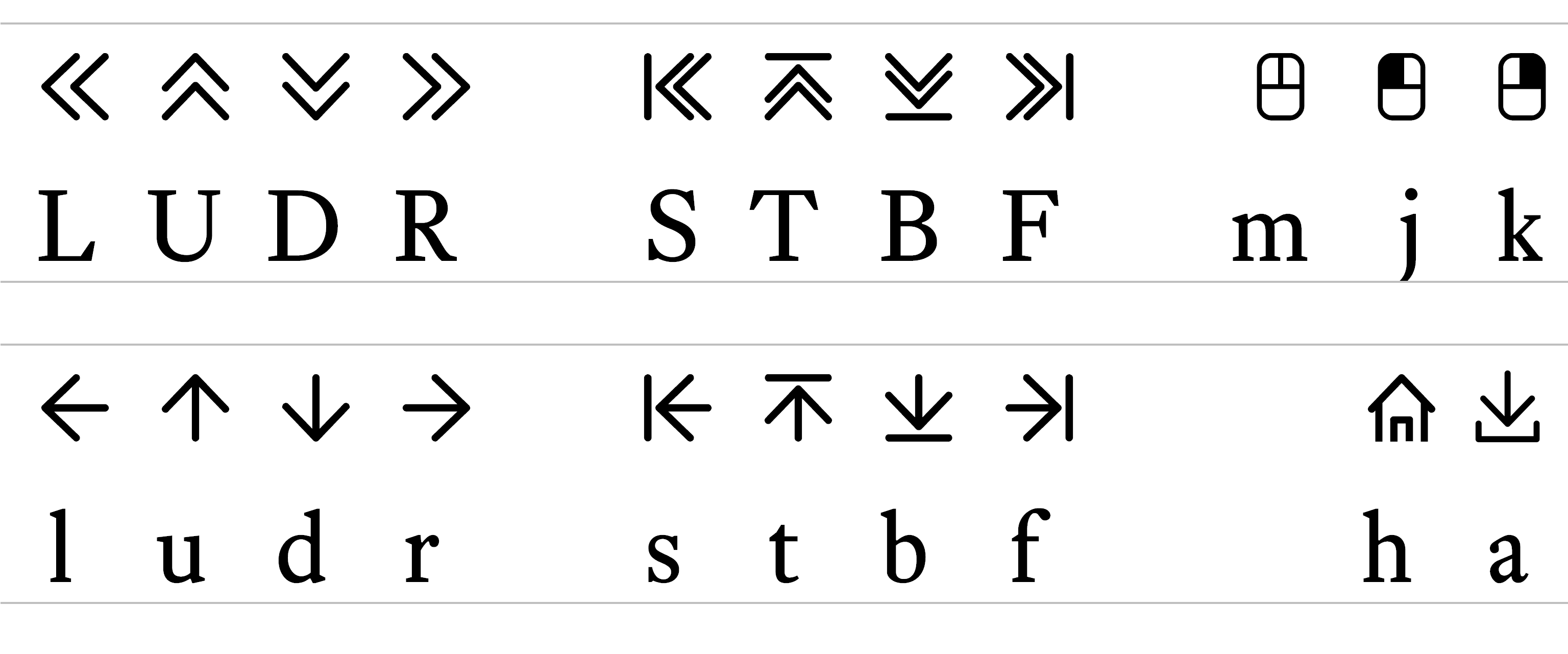
This font consists of some simple icons used for navigation. It has its own WOFF file (ps-icons.woff) and consists of the following characters:
The keys I assigned the symbols are as follows (and this was my logic):
L/l U/u D/d R/r |
Left (uppercase - double arrow, lowercase - single arrow) Up Down Right |
|
S/s T/t B/b F/f |
Start Top Bottom Finish |
|
a h m j k |
Download (because the D was already taken) Home Mouse Left click (above and left of M key) Right click (above and right of M key) |
There are lots of Icon fonts out there that you can use instead—it’s not necessary to use mine (the ionicons site has some nice ones)—I made the font more as an exercise to see if I could rather than because I needed to.
This font is my own poor attempt to recreate Mr Butterick’s Concourse Index font: the numbers with a circle around them, like this:
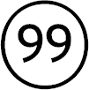
Now, Mr Butterick is a font designer and he does something clever—I’m guessing with ligatures—that allows double digit number to render all the way up to 99, if I type 99 in Concourse Index I get . See, clever.
Mr Butterick, I’m sure, knows this stuff backwards, but I don’t, I’m learning as I go along and this was a step too far. So I made an engineering decision to approximate what Mr Butterick did (I took a shortcut).
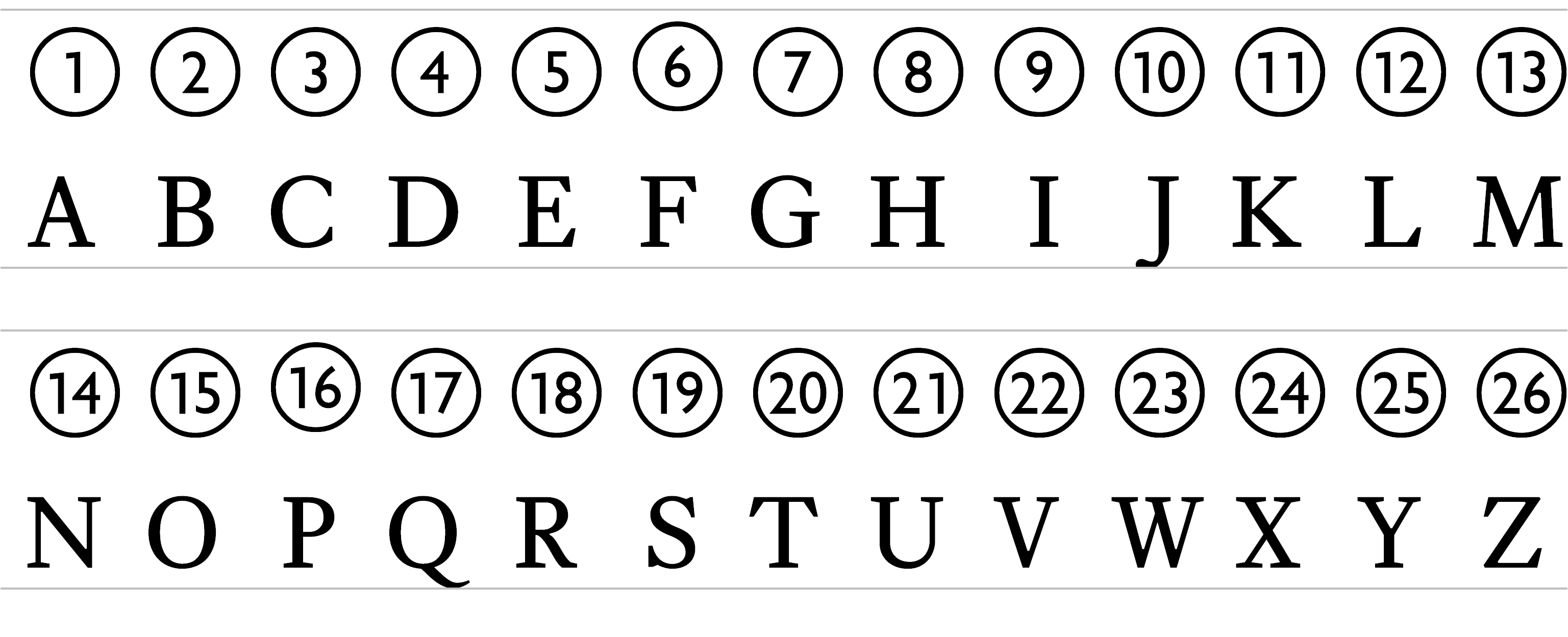
I don’t know how to make ligatures; but what I do know is that HTML lists (see section xxx) that normally use numbers to indicate points: 1, 2, 3, 4 &c. can be changed to use uppercase (or lowercase) letters to indicate points: A, B, C, D, E, F...&c all the way to Z; then it starts with AA, AB &c. This gives me the option to define 26 list points and that is probably enough for most lists.
I created 26 characters (font designers call them glyphs) and mapped them to the following characters:
It means I can replicate to some extent the Concourse Index font. I also mapped the first nine glyphs (A-I) to the numbers 1-9, this means that a list will work as numbers for the first nine points. It actually works for zero too; i.e.:
Again, I make this font freely available. Use it if you want to. Get it here