9

9Fonts & web fonts

9.1

Different types of fonts and web font formats

I waxed lyrical about the Equity fonts and why I’m using them in § 3.2.1, I also explained my reasons for swapping them for open source fonts in the downloadable version in § 1.3; the upshot is that I’m using the Equity fonts on the website proper and this is how I went about it.

The process I describe here for converting the Equity fonts to web fonts works for all fonts; I should stress that being able to convert a font into a web font does not necessarily give you permission to do so. There are copyright considerations with every font.

In my case, I have purchased the Equity fonts and have permission to convert them to web fonts for use on this websites.

So if you’re happy with that, the next question is: what type of font to convert?

9.1.1

What type of font to convert?

Fonts generally come in two formats: TrueType fonts (TTF) and OpenType fonts (OTF).

TrueType fonts were developed by Apple and Microsoft (sometime in the 1980s), they are (or possibly were) the most common fonts on Windows machines. TrueType fonts have the extension .ttf.

OpenType came after TrueType, it was developed by Microsoft and Adobe, and was based upon the TrueType standard; it uses the same basic structure as TrueType but supports additional features (stylistic sets &c.).

It is generally true that OpenType fonts have the extension .otf; however, OpenType fonts come in different flavours, the one that has the .otf extension is actually referred to as OpenType CFF (compact font format) which is based on PostScript type 1†1 format. OpenType also has (just to add to the confusion) a TrueType flavour—OpenType TT and this (would you believe it) also has the extension .ttf.

“What’s the difference?” I hear you ask.

Well, OpenType CFF uses cubic Bezier curves and OpenType TT uses quadratic Bezier curves—all clear? Glad I could sort that out for you. If you really want to know what that means, try this website. It’s actually quite fascinating, just look at the animations—who the hell thinks of this stuff?

Generally, there isn’t much to choose between these formats, the OpenType CFF format (with the .otf extensions) have slightly smaller file sizes (because they use cubic rather than quadratic Bezier curves—fewer points per curve).

Back to the original question: what type of font to convert?

The answer is easy.

  1. Always use OpenType CFF†2 fonts, these have an .otf extension

If these are not available use:

  1. OpenType TT fonts, these have a .ttf extension

And failing that use:

  1. TrueType fonts, these also have a .ttf extension

This leads on to the next question: What format should I convert the font to?

†1 PostScript Type 1 was a font format developed by Adobe in the 1980s, predating TrueType, TrueType was developed as an alternative to PostScript.
†2 Sometimes referred to as OpenType PostScript or OpenType PS

9.1.2

What format to the font to?

CSS 3 introduced the ability to encode fonts and make them usable on a website†3.

It supports the following formats:

  1. TrueType fonts (TTF)

  2. OpenType fonts (OTF)

  3. Web Open Font Format (WOFF)

  4. Web Open Font Format 2 (WOFF 2.0)

  5. Saleable Vector Graphic fonts (SVG)

  6. Embed Open Type fonts (EOT)

“Hang on” you’re thinking “if it already supports OTF and TTF why are we converting them?”

Well, the answer is file size. The Equity regular font in its native OpenType TT format is 182,252 bytes, after converting it to WOFF, this falls to 60,516 bytes; a 77% saving.

This saving is typical, most fonts compress to between 25-35% of their original size and this is a substantial saving and worth the effort of conversion.

So we’re not using the TTF and OTF options, the last one EOT is only supported by Microsoft (it was invented by them and is only supported by Internet Explorer), so we’re not using that one either.

SVG fonts are a method of using saleable vector graphic shapes as font characters, again this is not well supported and we won’t be using it.

That leaves WOFF and WOFF 2. WOFF 2 will become the standard font format; it offers much better compression than WOFF (it will make the font files smaller still). However, WOFF 2 is in the early stages of adoption by browsers and not all currently support it (see here).

This leaves WOFF and this is the one we will use, WOFF is very widely supported by browsers.

So the answer to the question: what format should I convert the font to? Is:

  1. WOFF

†3 Before this, websites used web safe fonts; this was a common set of fonts that were available on most internet capable machines. At the safest, this consisted of just five fonts: Arial, Courier New, Georgia, Times New Roman and Verdana. Other fonts that can be considered relatively safe are Georgia, Lucida Console, Palatino, Tahoma and Trebuchet.

9.1.3

The additional features of OpenType fonts

This is for information and self-improvement only; skip it if you don’t want to know about ligatures and stylistic sets.

OpenType fonts (that is both OpenType CFF and OpenType TT) support additional layout features (known as OpenType features) that the basic TrueType fonts do not.

Broadly, these are:

  • Ligatures

  • Small capitals (small caps)

  • Alternate figures

  • Stylistic sets

Taking these in turn:


Ligatures

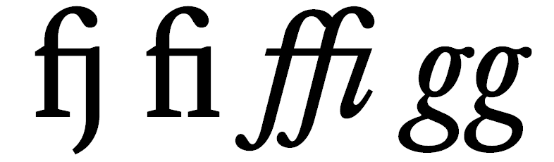
There are certain letter combinations with most fonts that cause the letters to “collide” with each other, it’s usually lower case ‘f’ and ‘g; characters and is more common in italic lettering; like this:

Font without ligatures Without ligatures

Here, the top of the f collides with the dot of the j and i characters. The bottom of the g characters also bump into each other.

To get around this, the font designers include special characters (called ligatures) that combine these problematic combinations into single characters; like this:

Font with ligatures With ligatures

Where fonts are supplied with ligatures, they should always be used. OpenType supports ligatures and so does CSS, it’s activated with the text-rendering: optimizeLegibility property (this is the same property that activates kerning, see § 7.4.3).

Small caps

Small caps (capitals) are shorter capital letters that fit in with lowercase letters. They look like this:

Now small caps are quite rare, most fonts don’t have them (Equity does and that’s what you see above). What most people think of as small caps are those that are artificially generated by word processors (and CSS), these are scaled down versions of the standard capital letters. You can see the difference below:

Real small caps Real small caps
Artificial small caps Artificial small caps
Expanded artificial small caps Expanded artificial small caps

I like small caps, I use them to highlight links on the website—they’re a subtle alternative to bold and italic emphasis.

Now this artificial rendering of small caps drives font designers mad—they don’t like it, it spoils the way their font looks—and I can see their point when I look at the above example, the top line definitely looks better. This is true even after adding more spacing between the letters (the bottom line).

However, (and here comes the wrath of the font designers) perhaps font designers should design more fonts with small caps—there are hardly any open source small caps fonts.

But my sympathy is still with them so I don’t use artificial small caps on the website.

If you do want to use artificial small caps in CSS, the font-variant: small-caps property turns it on.

Alternative figures

When I say figures, I’m literally talking about numbers, the 0123456789 on the keyboard. Now normally when you hit the number keys, you don’t really think about what those number look like (they’re just numbers) but look here:

The top and bottom of the numbers all line up, they are all the same height and they all start on the same base line, they are also pretty much the same height as capital letters (they’re a bit smaller with the Equity font above). These type of figures are called lining figures (I think because they line up).

The alternative to lining figures is oldstyle figures:

Oldstyle figures are more like lowercase letters and they are designed to look more natural in lowercase body text.

It’s a personal preference; it isn’t wrong to use lining figures in lowercase body text (although it is wrong to use oldstyle figures with all uppercase letters). It’s also true that the oldstyle figures live up to their name—they look old fashioned.

To make figures appear in oldstyle with CSS, use the property font-variant-numeric: oldstyle-nums (the font must be able to support it).

In my case, and on this website, I don’t use oldstyle figures.

Stylistic sets

Stylistic sets provide alternative character sets within a font. These can be to address regional differences, provide alternatives for specific situations (tall figures for example) or just because that’s what the font designer wanted.

Here’s an example, the Concourse font has the following standard characters (by default this is stylistic set 0):

Concourse Stylistic set 0 Concourse
Stylistic set 0

Now in England we’re not quite so frivolous—you can’t rule the world with ‘t’s and ‘g’s like that—it’s not primary school for Christ’s sake.

So there is a British stylistic set, in this case it is stylistic set 2 and it looks like this:

Concourse Stylistic set 2 Concourse
Stylistic set 2

Much more right and proper—kind of letters you can hang your hat on—just what the Empire needs.

This is what the French get:

Concourse Stylistic set 0 Concourse
Stylistic set 0
Concourse Stylistic set 3 Concourse
Stylistic set 3

Letters to surrender by, something very sad about that ‘Q’†4.

The Germans just use ours, but put the verb at the end of the sentence†5.

There’s a Swedish one too, but that’s just basically pornography.

I use stylistic sets on the website (mainly for the Concourse font). To set the stylistic set in CSS, use the property font-feature-settings: "ss##" where ## is the number of the stylistic set.

To change the Concourse font to use stylistic set 2 (the British settings) I use the property font-feature-settings: "ss02", it has to have the leading zero.

OpenType fonts can support up to 20 stylistic sets.

†4 John Cleese wrote an interesting article about something similar here.
†5 My old Dad used to say “A joke is no laughing matter to a German”—but then Hitler did blow his house up, not so much the verb at the end of the sentence as the bomb at the end of the drive.


End flourish image